No Longer for Just the “O” of ‘Once Upon a Time…”
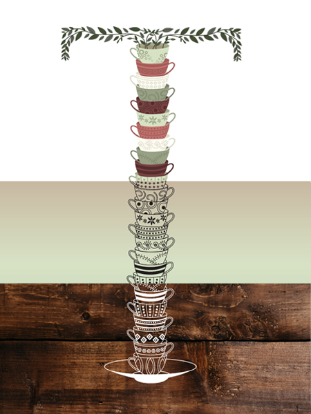
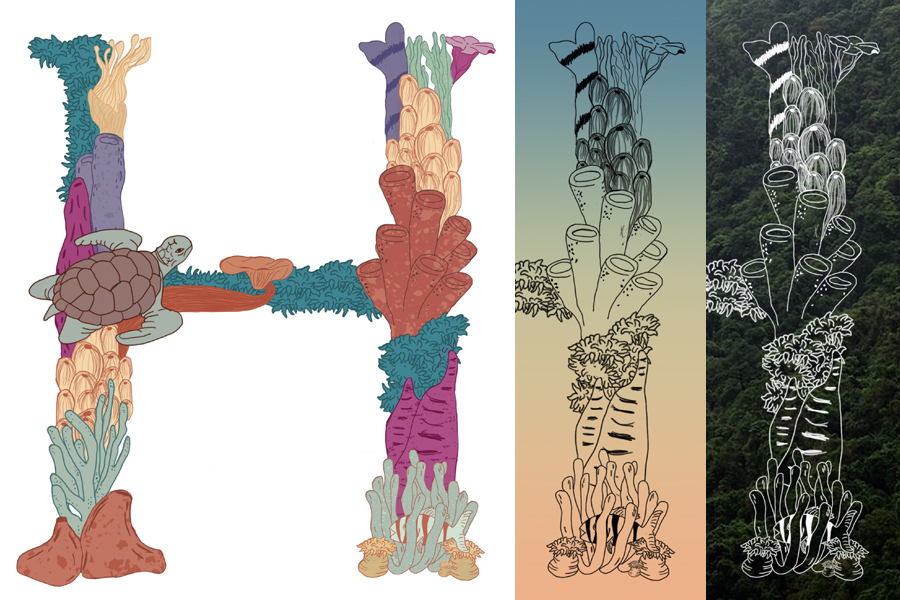
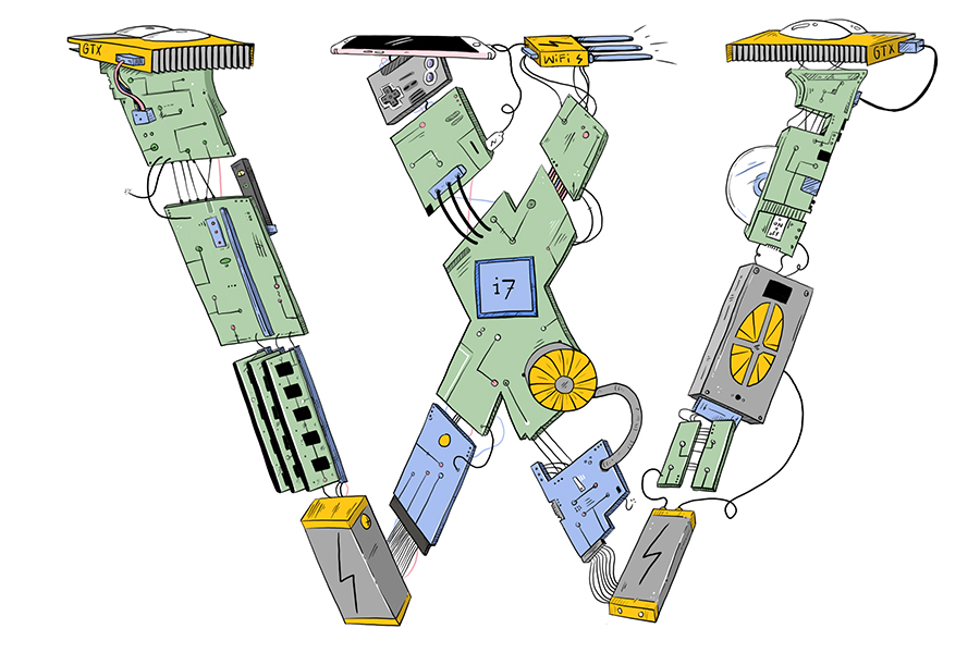
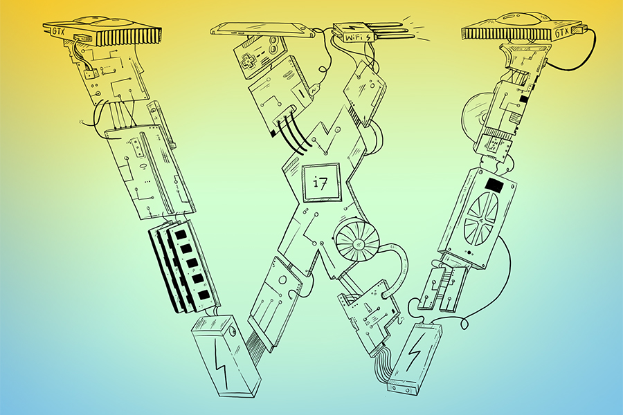
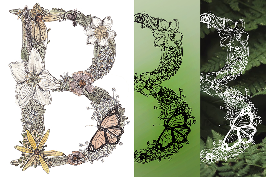
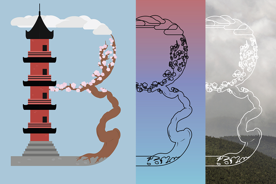
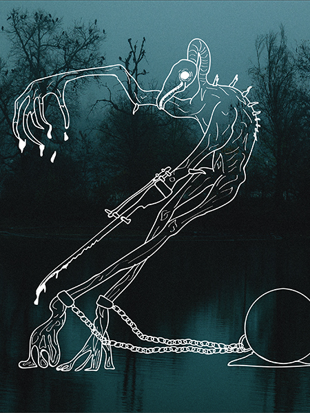
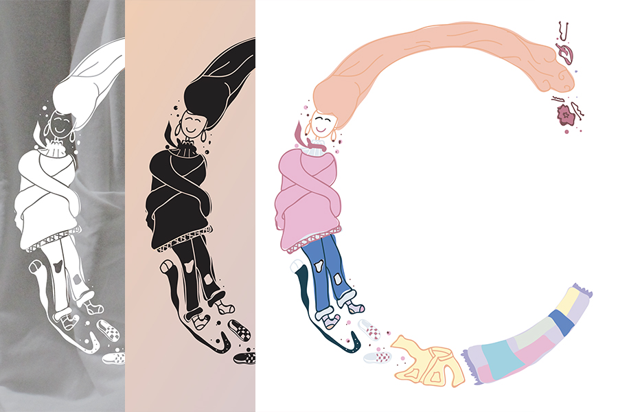
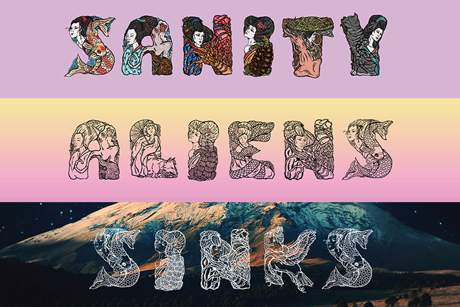
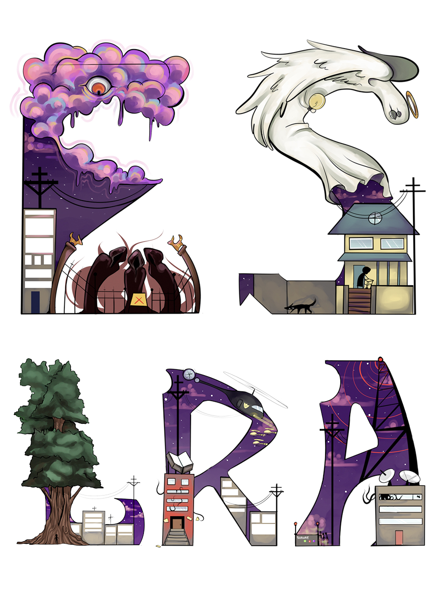
The scope of this project has ranged from students creating an abridged set of display letters to variations of a singular drop cap letterform. These display letters—sometimes referred to as Decorative, Ornamental, or Organic letters—include any type of lettering with embellished or decorative forms. While they often exhibit attributes of other classes, display letters are specifically meant to be used at large sizes where their detailed or unconventional features work best. For students working on the abridged set, they begin by developing a base typographic grid layout to support all the chosen letter structures, then proceed with a conceptual narrative interest to generate to the letterforms.
Display typeface artwork created by K.Lee, K.Louis, J.Girdner, H.Hoche, L.Shomion, E.Schulz, D.Shonyo, R.Koch, and M.Trom.
This specific project has been part of both 3xxx-level Digital Illustration and Graphic Design IV studio-courses. The focus of both studios has included the exploration and application of concepts and techniques of illustration within the digital medium, projects included incorporation of narrative/storytelling, point of view/perspective, lighting/depth, and characters/relationships.


