Overselling the Event Can Be Bad, but Secretly Educating the Public is Good. Right?
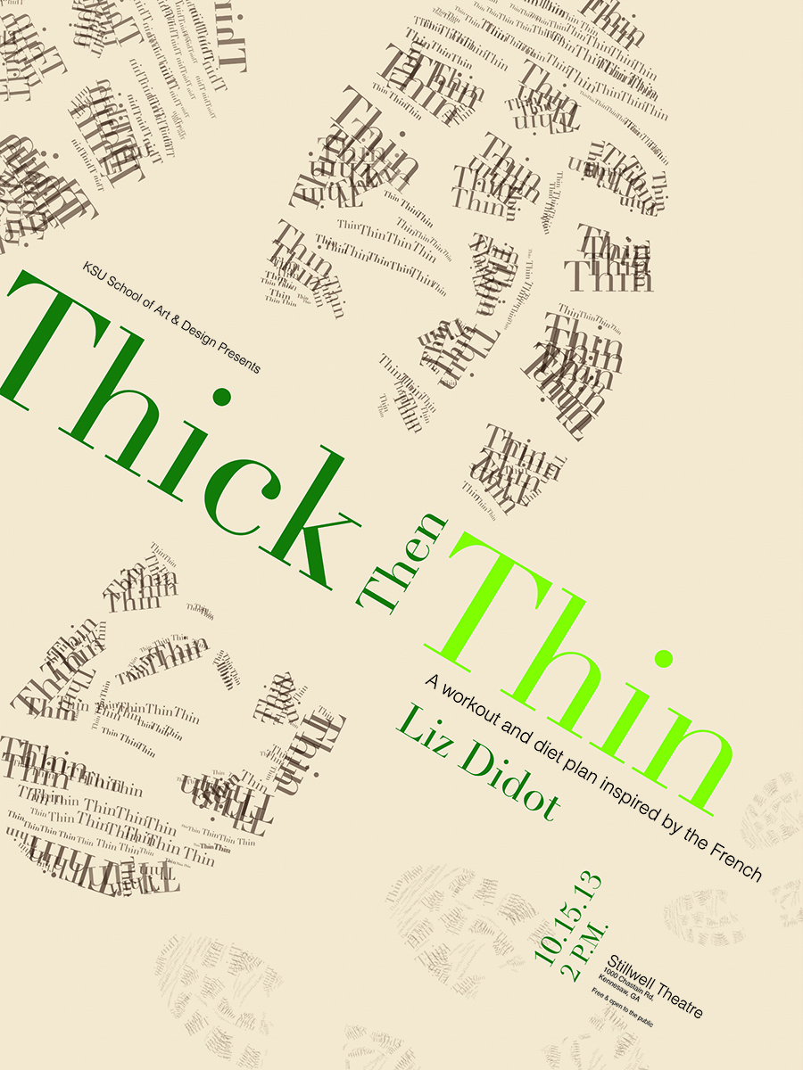
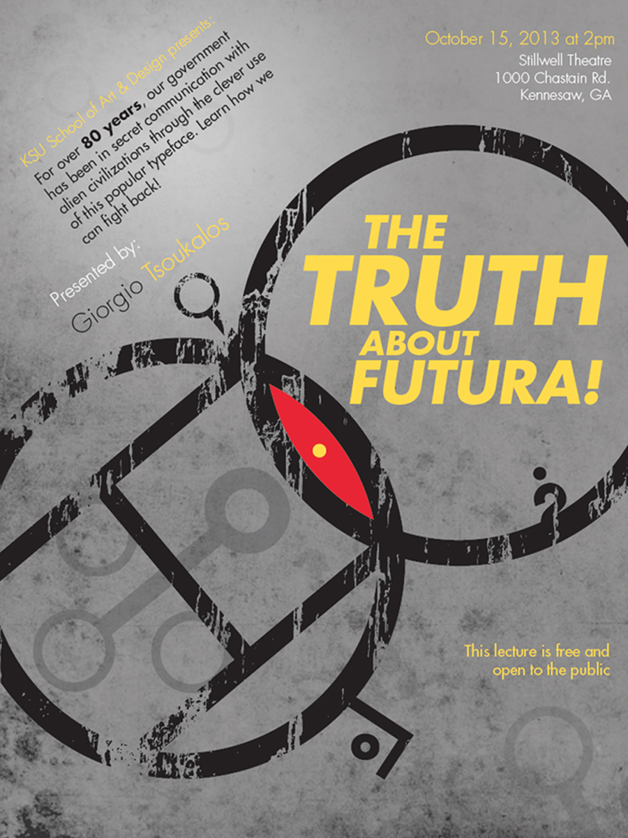
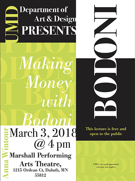
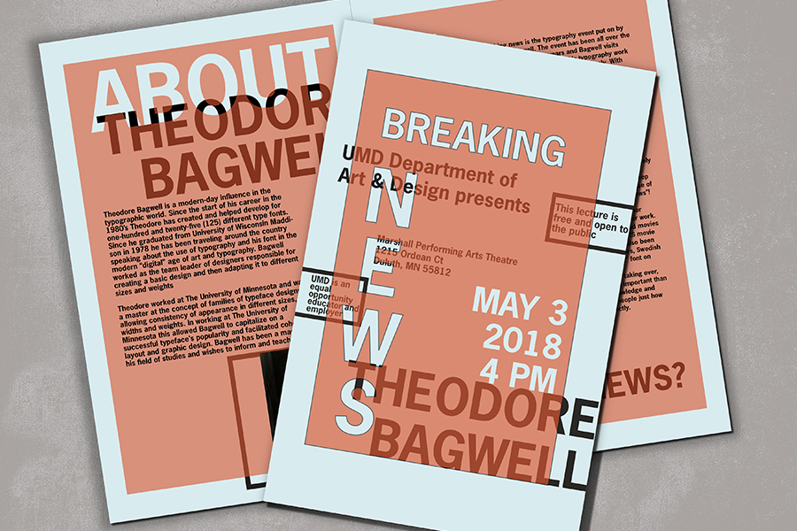
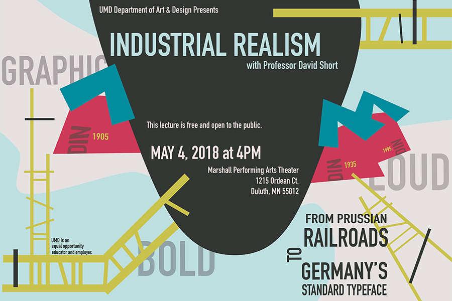
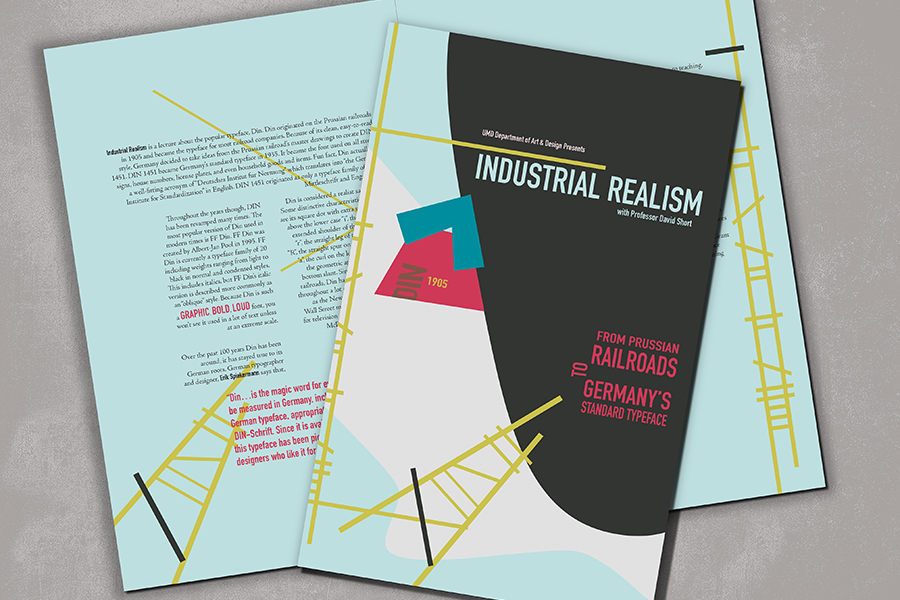
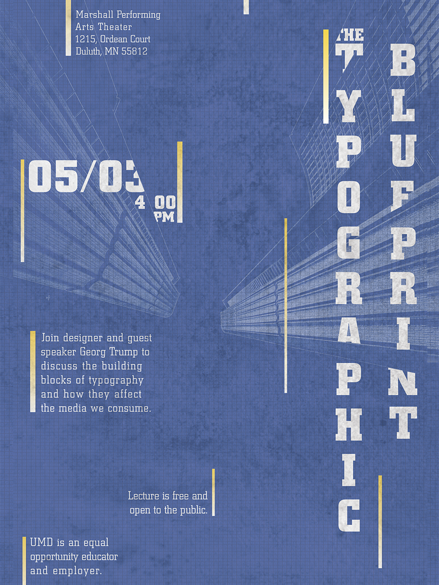
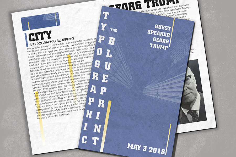
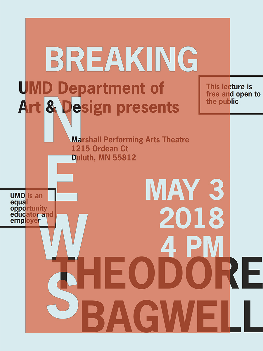
For this project students first draw names and select a typeface (from a provided list) and give the class a five-minute history lesson on said typeface. Then they are charged with designing a large poster for an upcoming lecture about their chosen historic typeface. Based on the research and learned content, the students propose a topic for a faux-event, and the name of a guest/speaker, and the primary target audience—the topic may be a modern interpretation of subject matter dealing with the typefaces’ history/origin or possibly the typeface’s specific designer(s). Later it is revealed the client has, ‘asked for an expansion of the project’ to now include a handout to be provided to guests at the event; so the students now evaluate how their design work translates from poster to a multipage handout.
Typographic posters and handouts created by K.Waugh, J.Thomas, K.Wilkinson, G.Lindenau, T.Collins, J.Becker, A.Pinor, R.Primus, and S.Caswell.
This specific project is part of a Typography I studio-course. This course is an introduction to communication design with a strong emphasis on typography, developing a fundamental understanding of its structure, history, technology and application of principles of lettering. Typographic syntax, concept development and visual hierarchies are stressed. Design history research as it relates to each topic is incorporated.