A Communal Theatre Group Based in Atlanta, Georgia
Of course they are dramatic (in the theatrical sense) but Big Top Theatre also continually worked to be educational and inspirational. BTT was an organization created with the intent to share both a passion for the theatrical/performing arts; but to also create a safe-space for participants to express themselves and learn more about the performing arts through direct participation in shows and workshops.
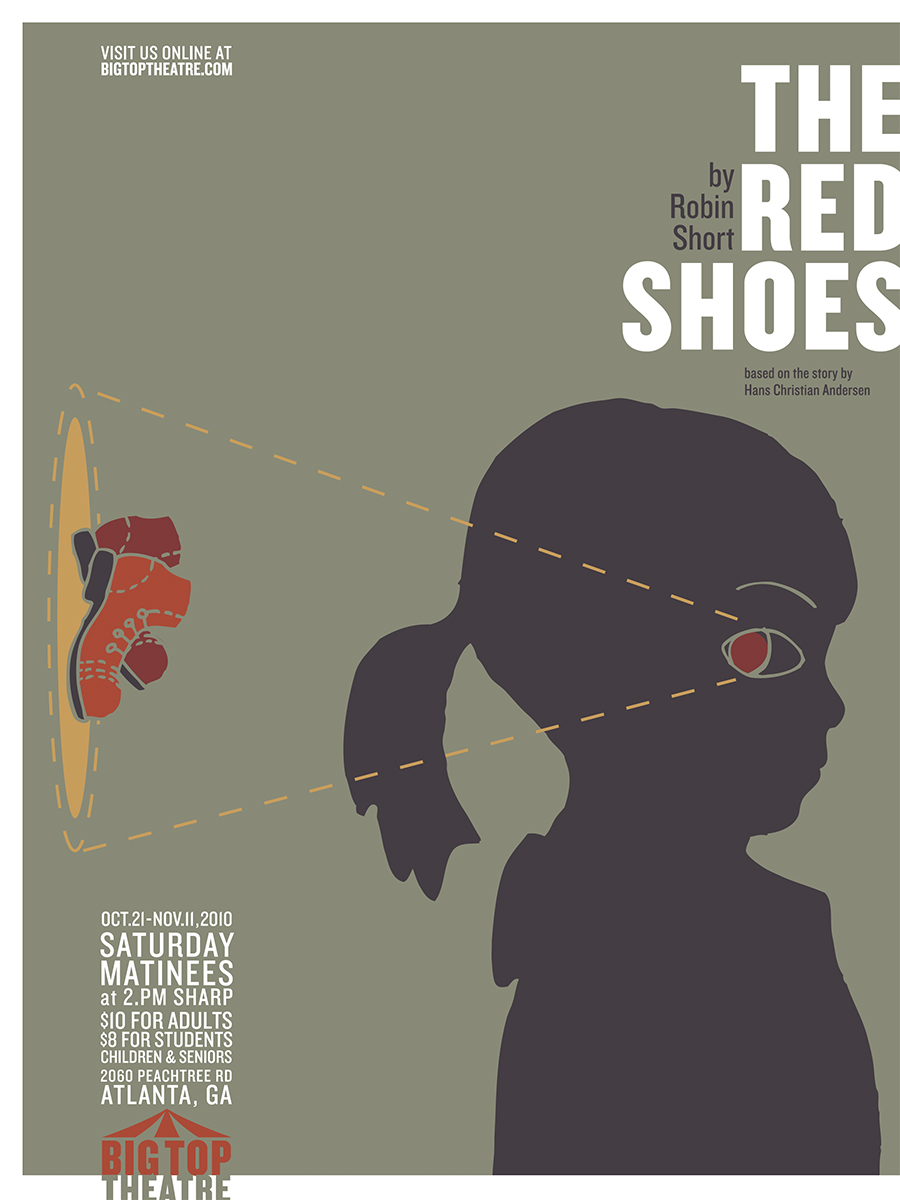
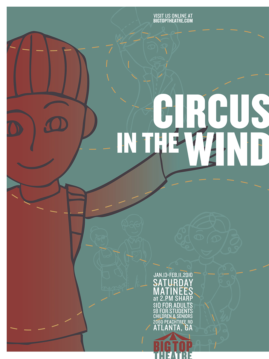
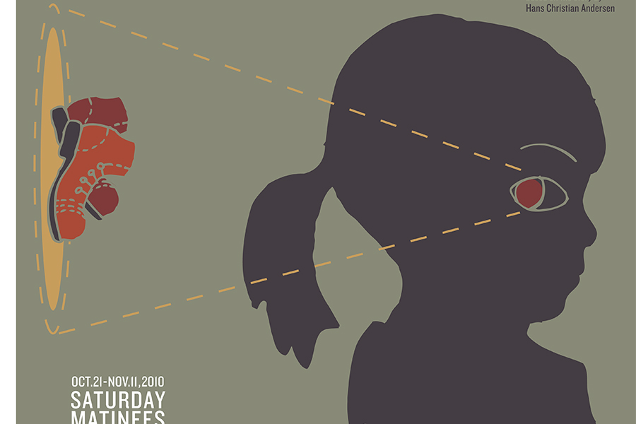
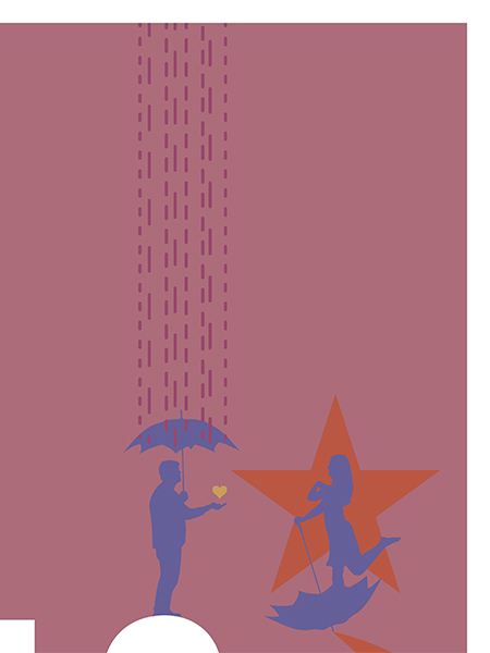
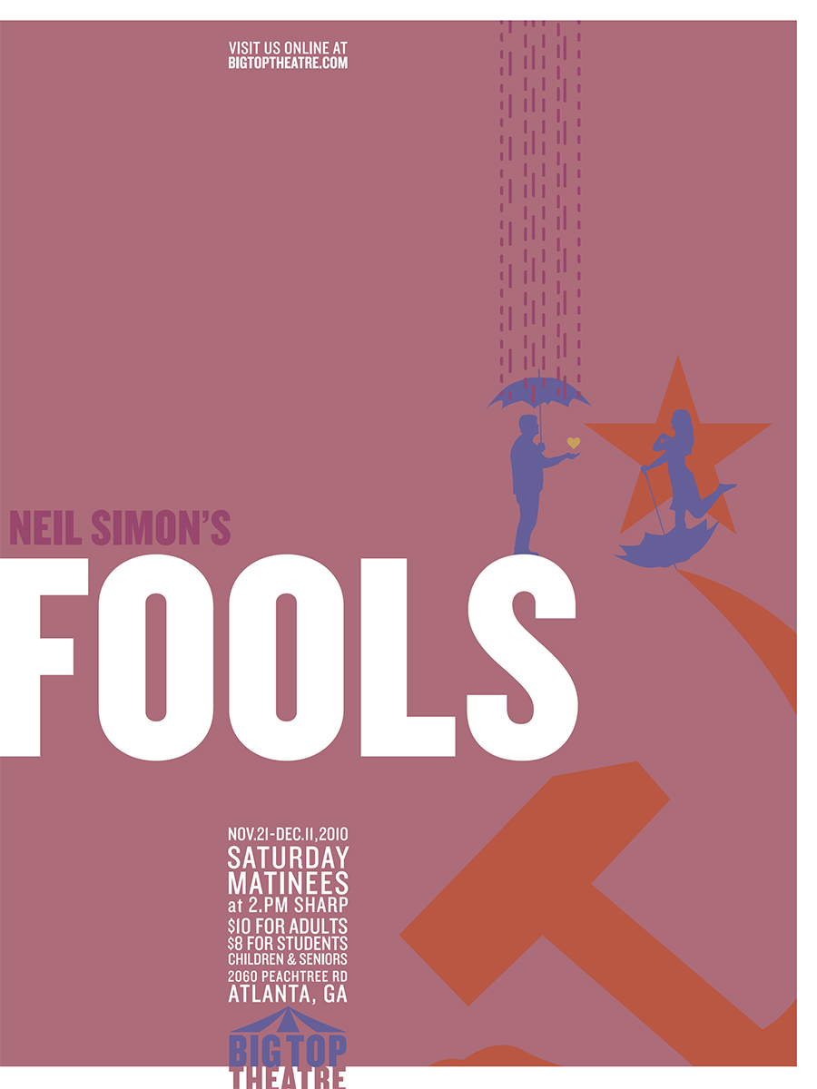
My focus with this project was to create both a primary brand mark and a style of illustration to promote their programming. The style concept was to use the recognizable dashed-line element to guide viewers around visuals—much like an old treasure map to “X marks the spot!”; except in this new instance there will be multiple paths, travels back and forth, calm reflections, chaos, and/or full- or piecemeal-presence of lines; just like the potential concepts in the storylines their shows challenged audiences with.
The children’s daytime productions were refined with caricature-style illustrations, while the evening performances were focused with distinct geometric shapes, typography, and actual silhouettes of the actors in the shows. All posters would use primarily bold swashes of color to keep messages direct and less of the overly-photo collaged style much of the Atlanta area was currently focused in at that time. The white framing element was partially to represent the black-box mobility of their theatre, but also to be open/incomplete on one edge to invite the audience in, to allow for what might read as an imperfection to become an access point of conversation.