Pop-Quiz Students: Define ‘Faculty Exhibition’
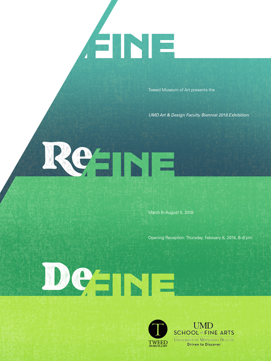
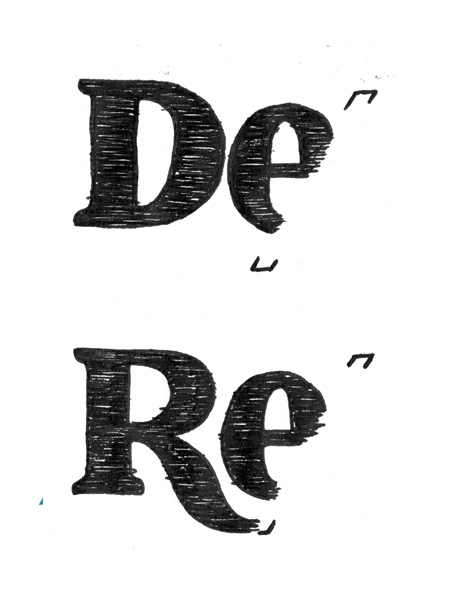
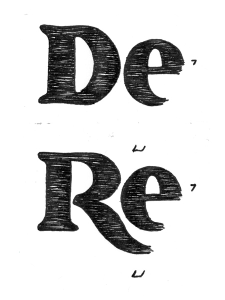
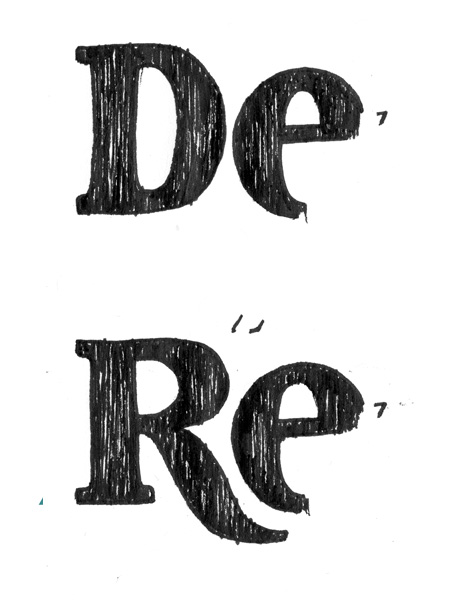
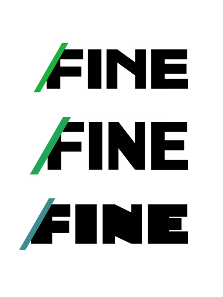
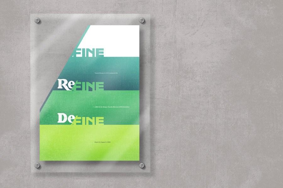
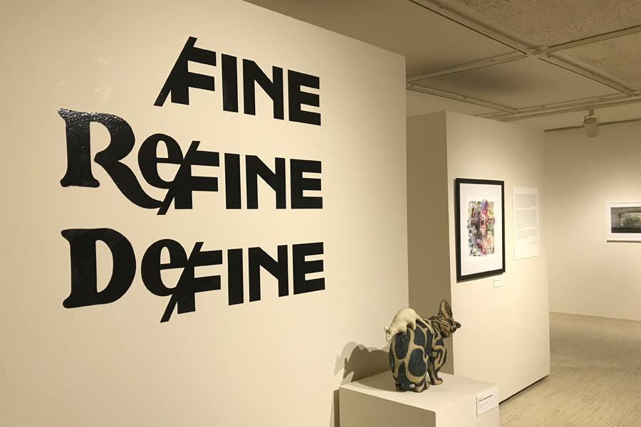
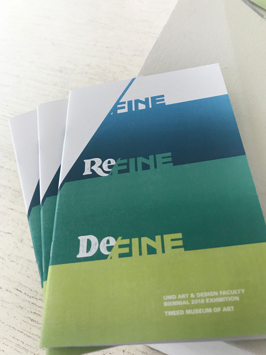
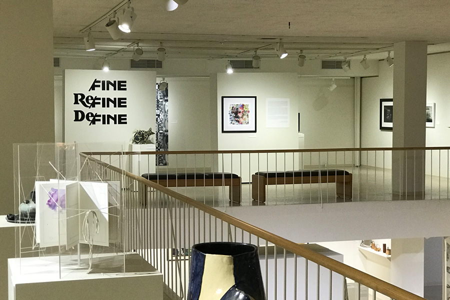
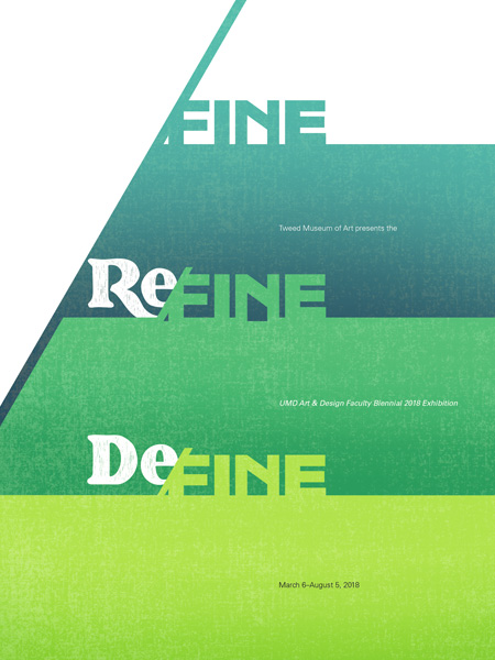
Put two designers and an art historian in a room together and what do you get? An art and design faculty show with its own thematic concept; unique name; a half-analog/half-digital brandmark; and its own typeface. Who would of thunk? Turns out we did.
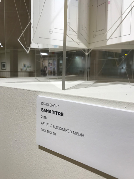
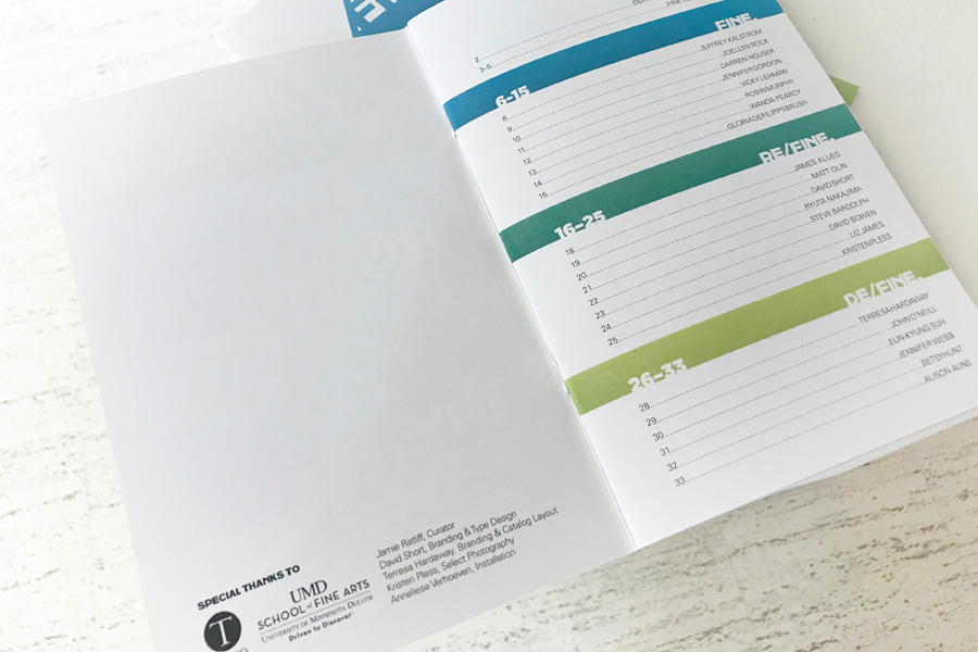
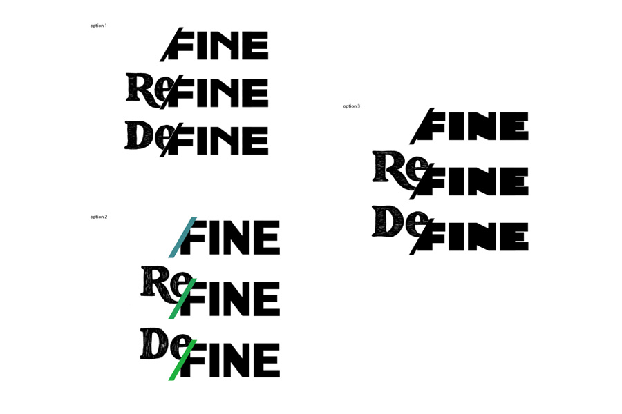
After the show concept and name developed, my responsibilities (read: undertaking) were to develop the exhibition brandmark, color palette, and poster design. As the project evolved it became apparent a full uppercase display typeface would work well not only for the brandmark and poster/advertising; but for the exhibition catalog and name plates as well. The color palette and implied depths focused on Duluth’s relationship to Lake Superior and the natural parks that flow through it.
Presenting a greater inclusivity for all areas of the art and design department: Art History, Art Education, Studio Arts, and Graphic Design allowed students and surrounding community to witness a large collaborative effort. Practicing what we preach!
