Community That’s Not Simply Black and White
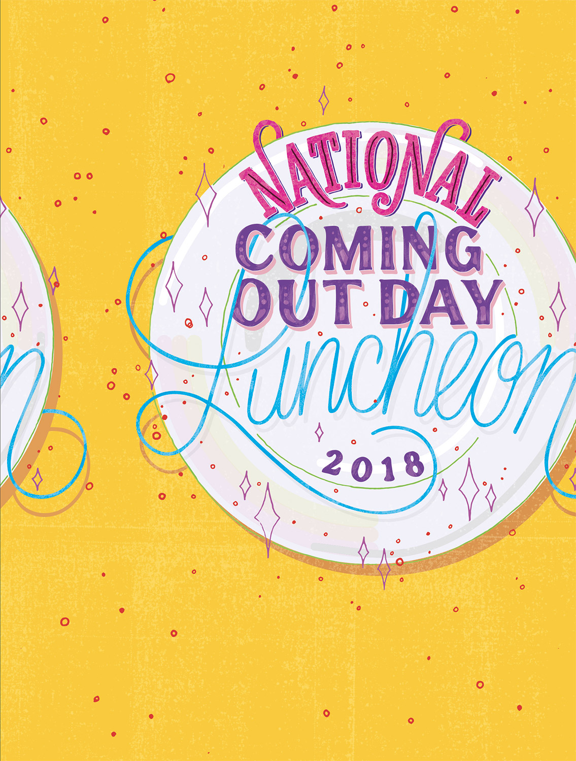
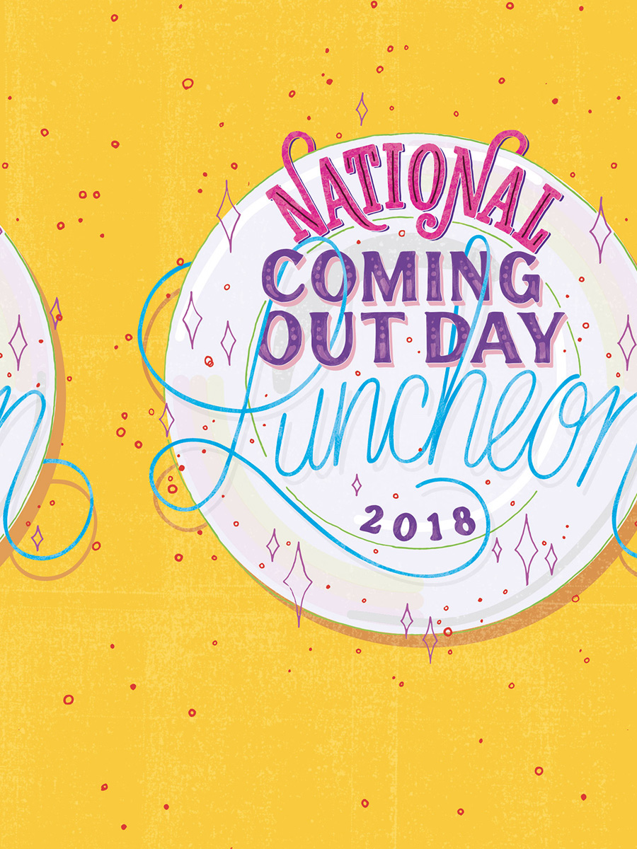
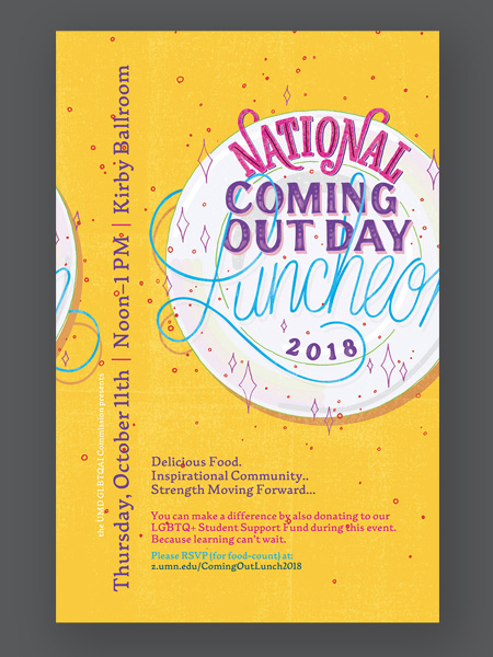
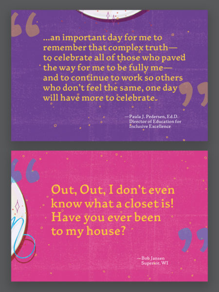
The coming out process can be challenging, continual, and repeat frequently for each member of the LGBTQ+ spectrum. My goal was to create the main branding to echo those observations by moving off the edge of every composition—and yet reappear on the other side—representing this cyclical nature of the coming out process. And with the silhouettes and colors used, present a celebratory nature of said process; for there should be no shame in that moment; it is significant to our community as humans.
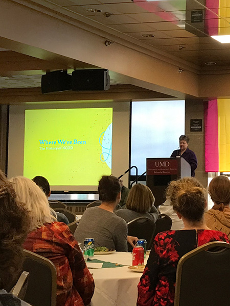
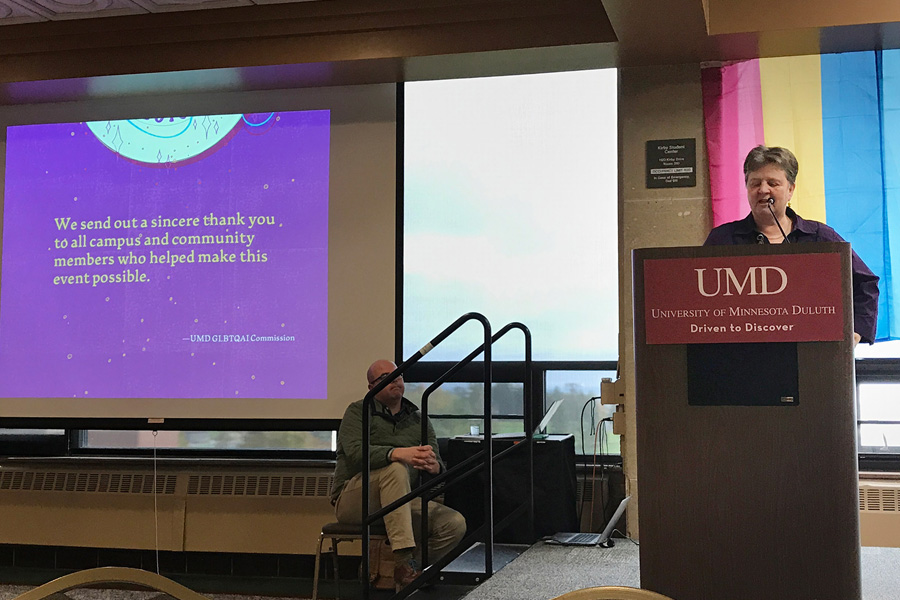
The event itself is a national luncheon event—in this scenario sponsored by the University of Minnesota Duluth—to give a voice to the power of living openly, honestly, and with authenticity at work, in families, and in communities. Each person has many layers of identity and their story is to work together to create a world allowing people to bring their ‘whole self’ to everything they do.
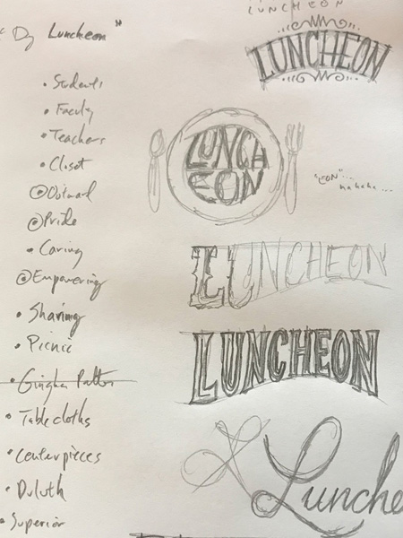
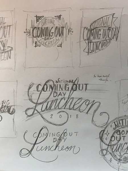
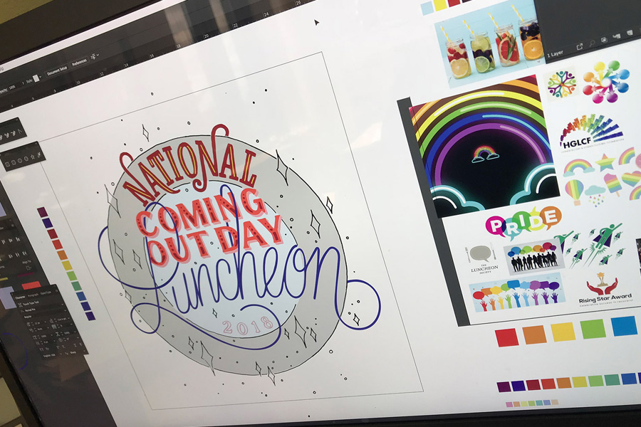
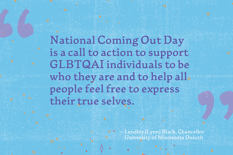
My whole-self brought custom hand-lettering, illustration, a custom typeface, and a celebratory color palette to generate an event brand that strives to have as many layers of identity as its originators. As no person in our community is simply stereotypical, even me!


