Let’s Use it in a Sentence, or Perhaps A Lot of Sentences
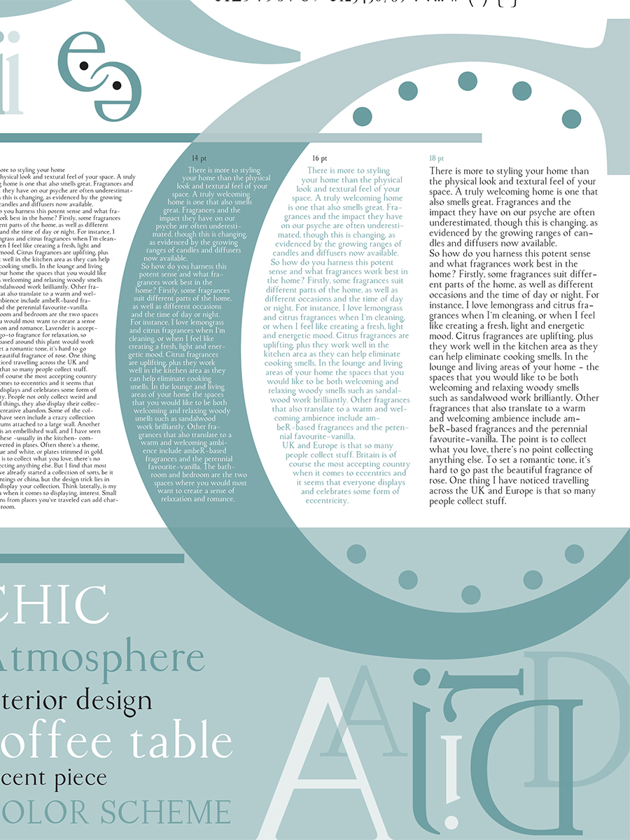
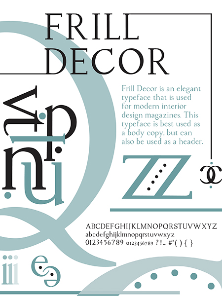
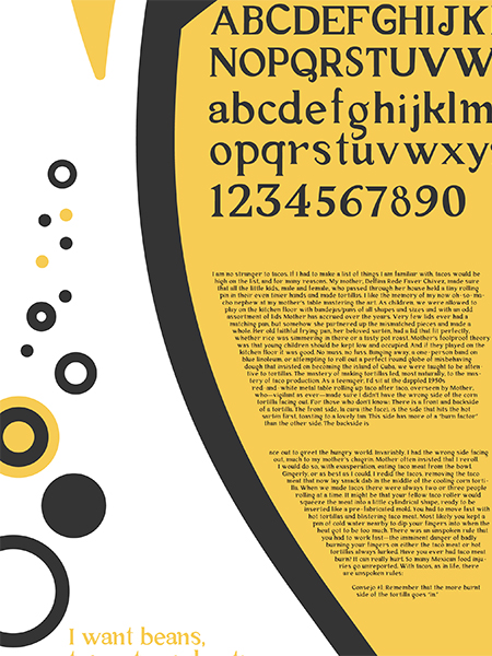
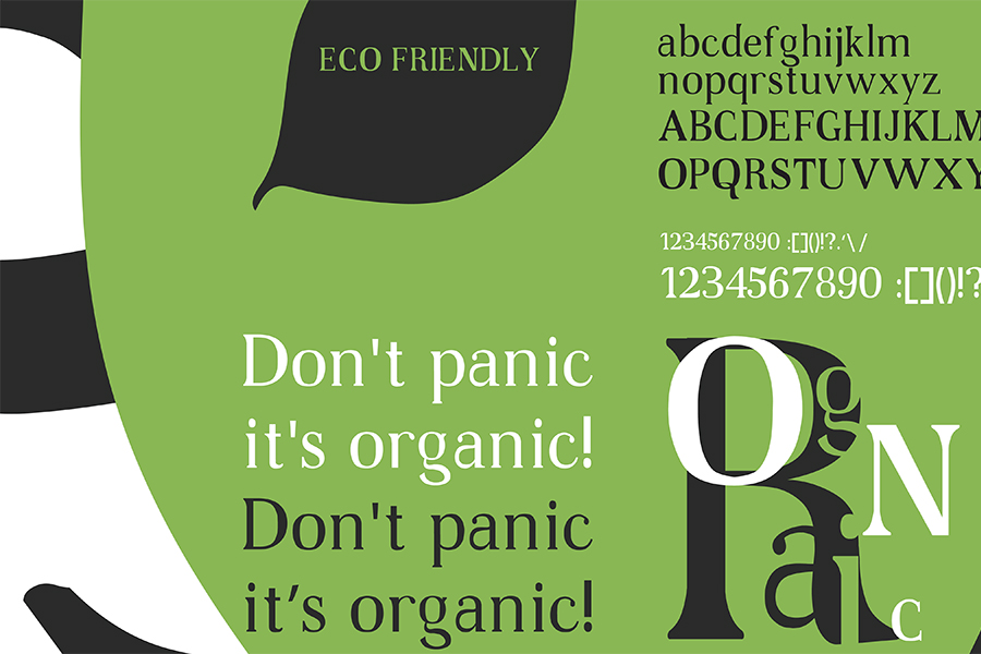
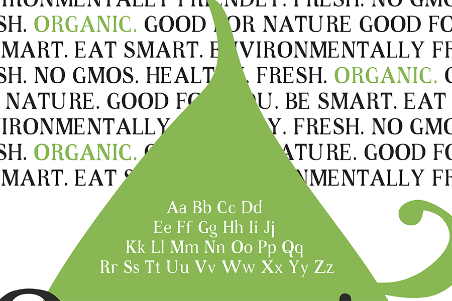
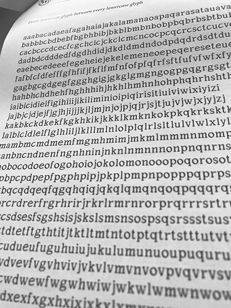
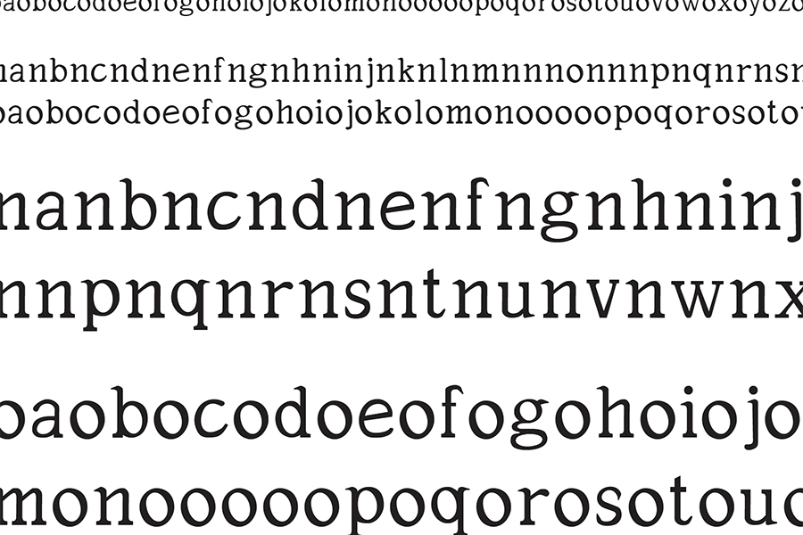
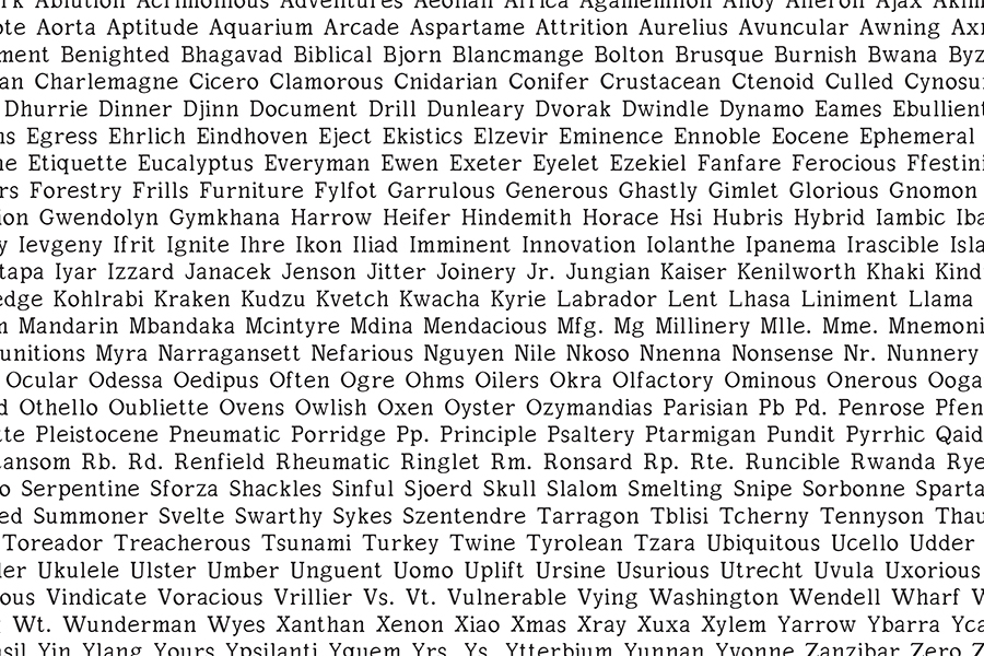
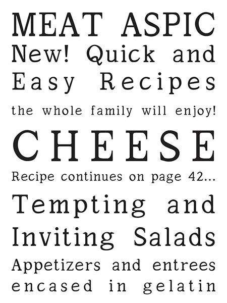
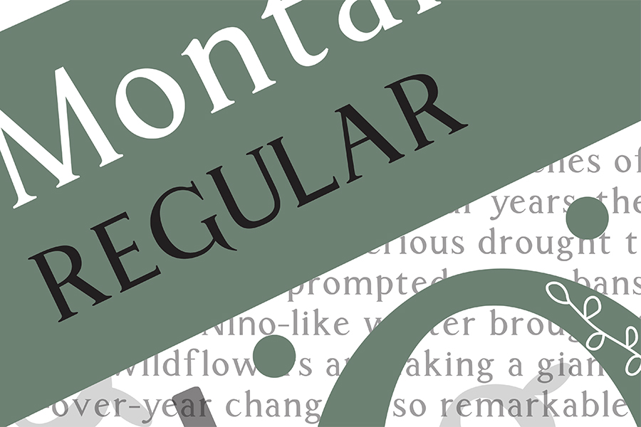
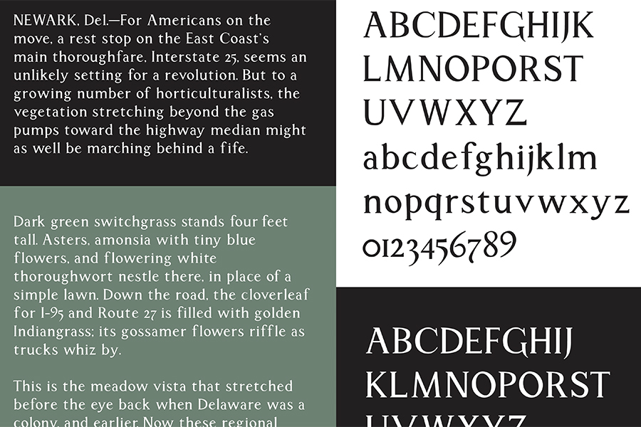
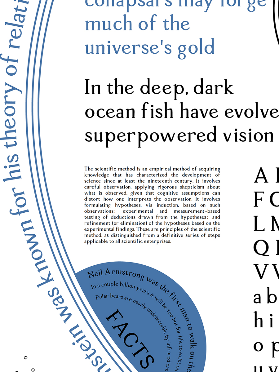
For this project—at its core—students were challenged to create a fully usable single-weight serif text typeface. Typefaces influence the appearance of visual materials almost more than any other component used in graphic design. Letter forms implement a specific kind of grid system, dealing with issues such as structure, optical compensation, legibility, and most importantly the often overlooked relationships between the letters and shapes within a typeface itself.
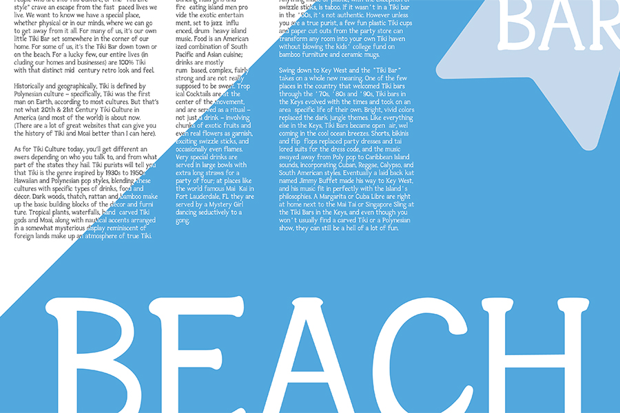
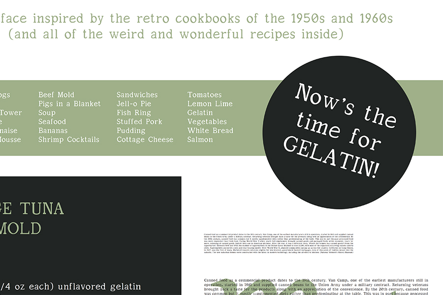
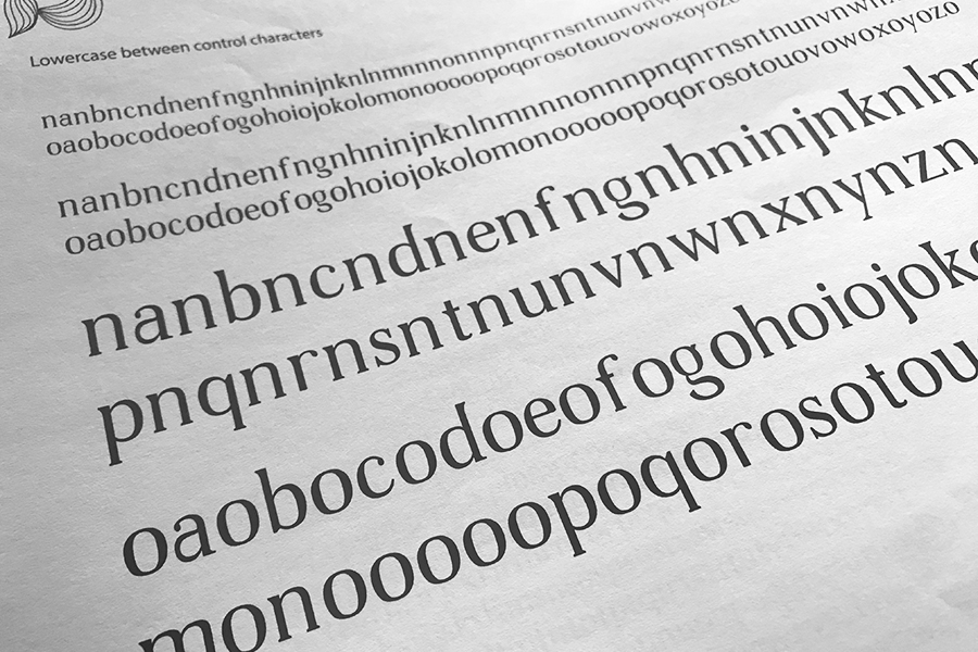
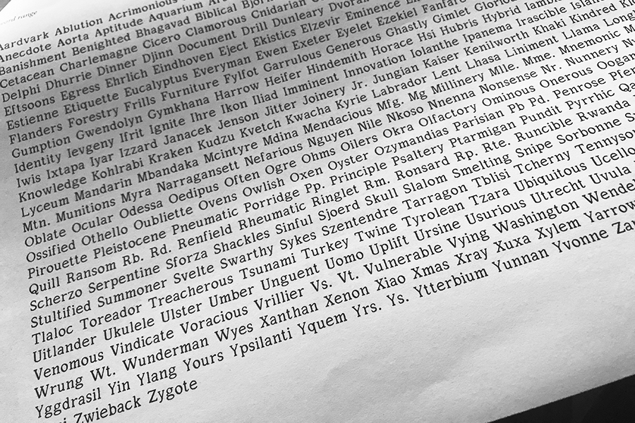
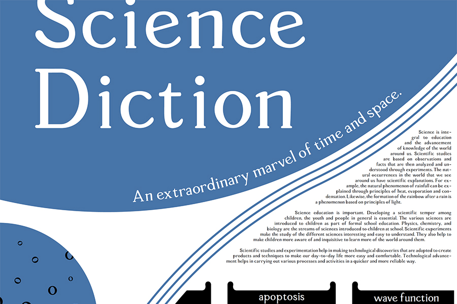
The preliminary design work involves working with translation pen calligraphy—avoiding the visual nuances of blackletter systems—and ink pen sketching techniques and exercises. Upon decision of the primary typeface use, the control characters for both upper- and lower-case letterforms are created and used to evaluate the typeface design and goes through a series of refinements before harmony between them begins to appear. Then the expansion into the rest of the twenty-six letters, figures, and punctuation begins. Final deliverables included a two-color specimen poster to “promote sales” of the typeface, and a black-and-white type specimen multipage handout to show it’s detail specs.
Typeface designs created by L.Shomion, S.Conway, K.Anderson, B.Parr, D.Peterson, P.Jackson, E.Schulz, C.Wodicka, and S.Conway.
This specific project has been part of a Graphic Design IV senior-level studio. The focus of this course is the execution of quality illustrations and design by the blending of traditional and electronic image creations influenced and strengthened by the history of illustration and typeface design. The use of advanced conceptual skills and digital techniques, strong development of form and color, and the elements and principles of design are emphasized.